×
Projects About Resume Contact
App mockups

PayByPhone

MOBILE PARK & PAYMENT APP

Project Description

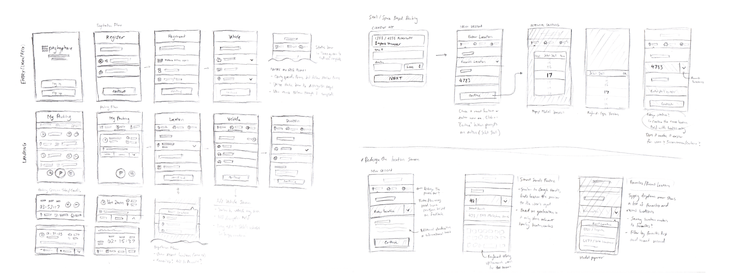
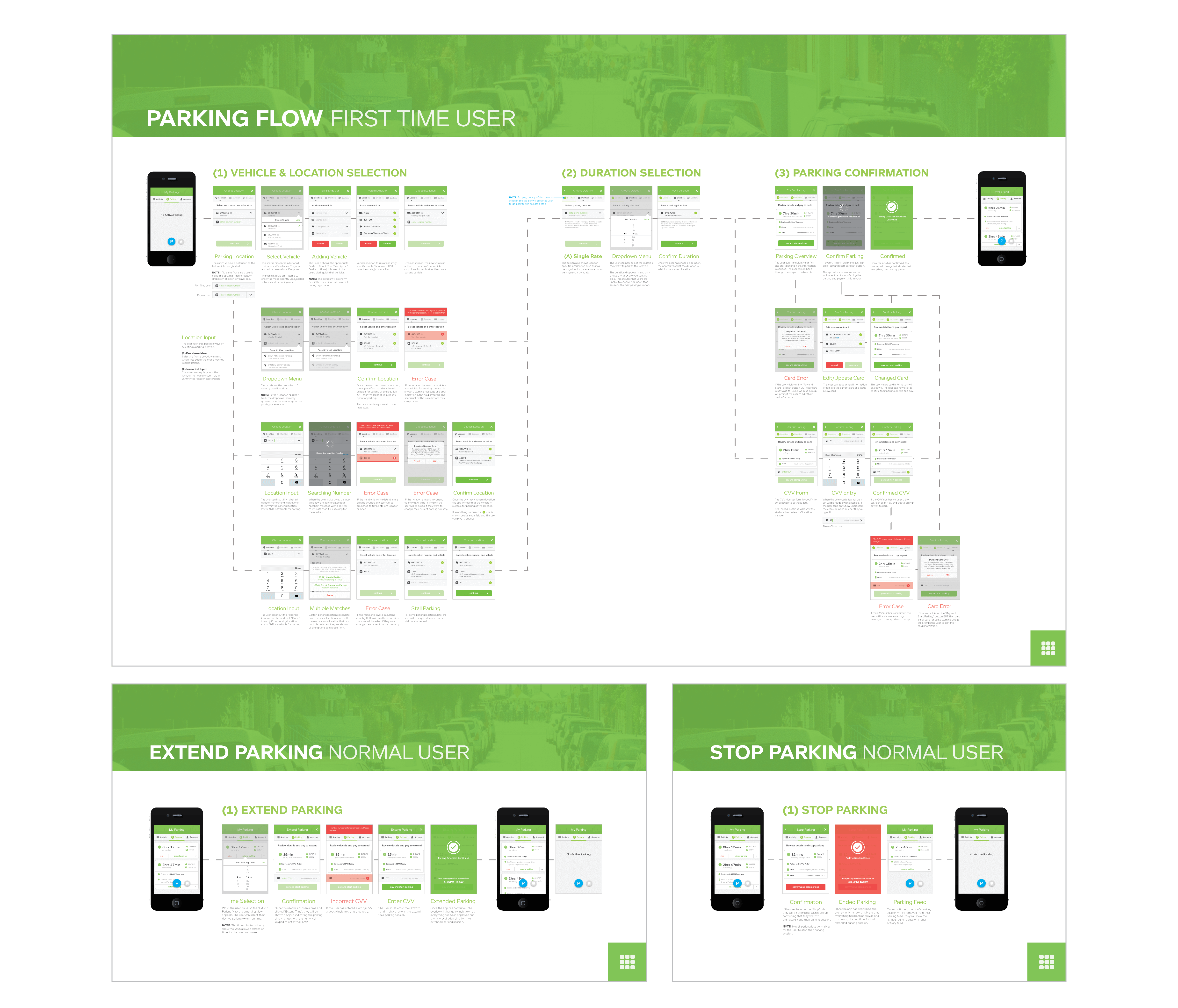
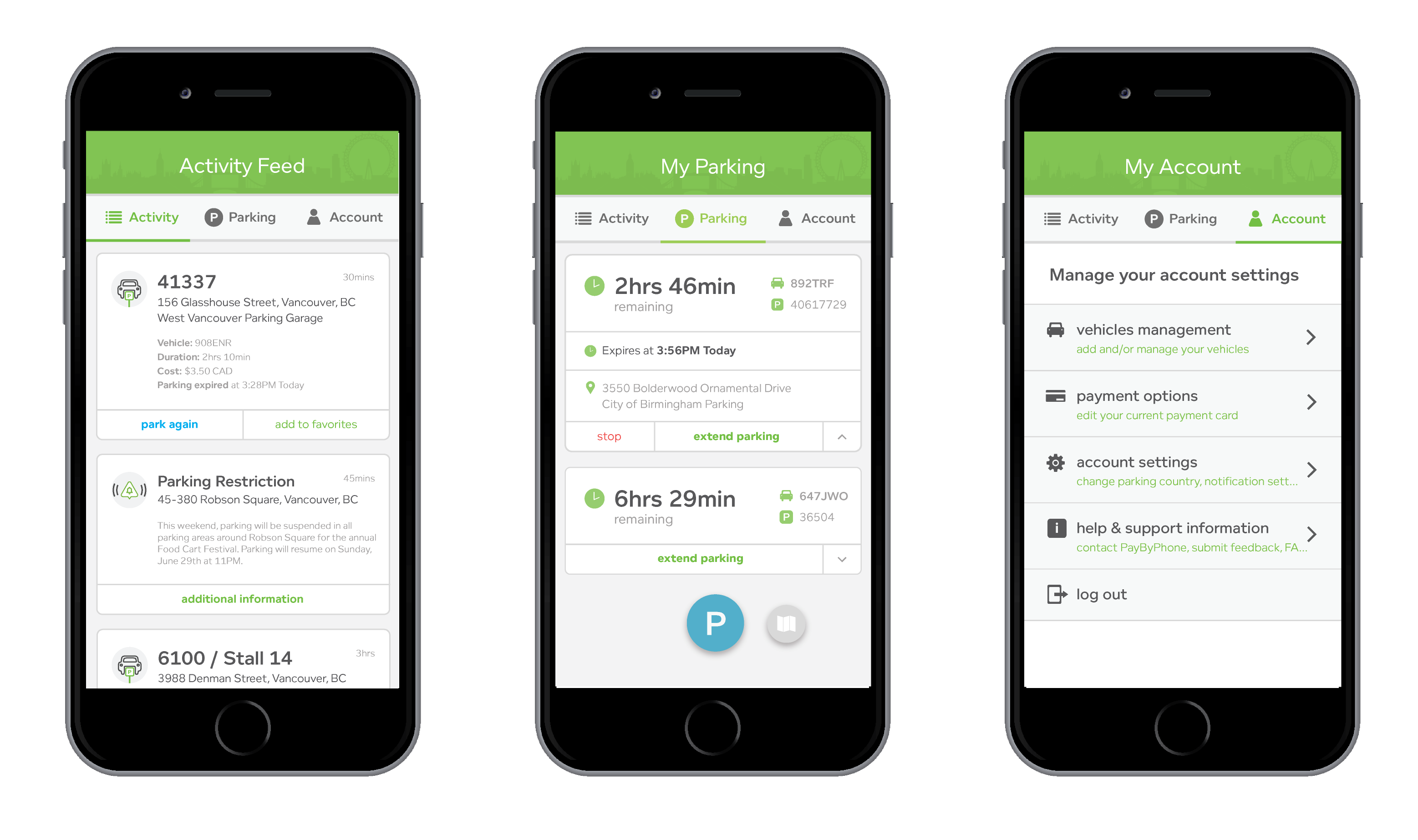
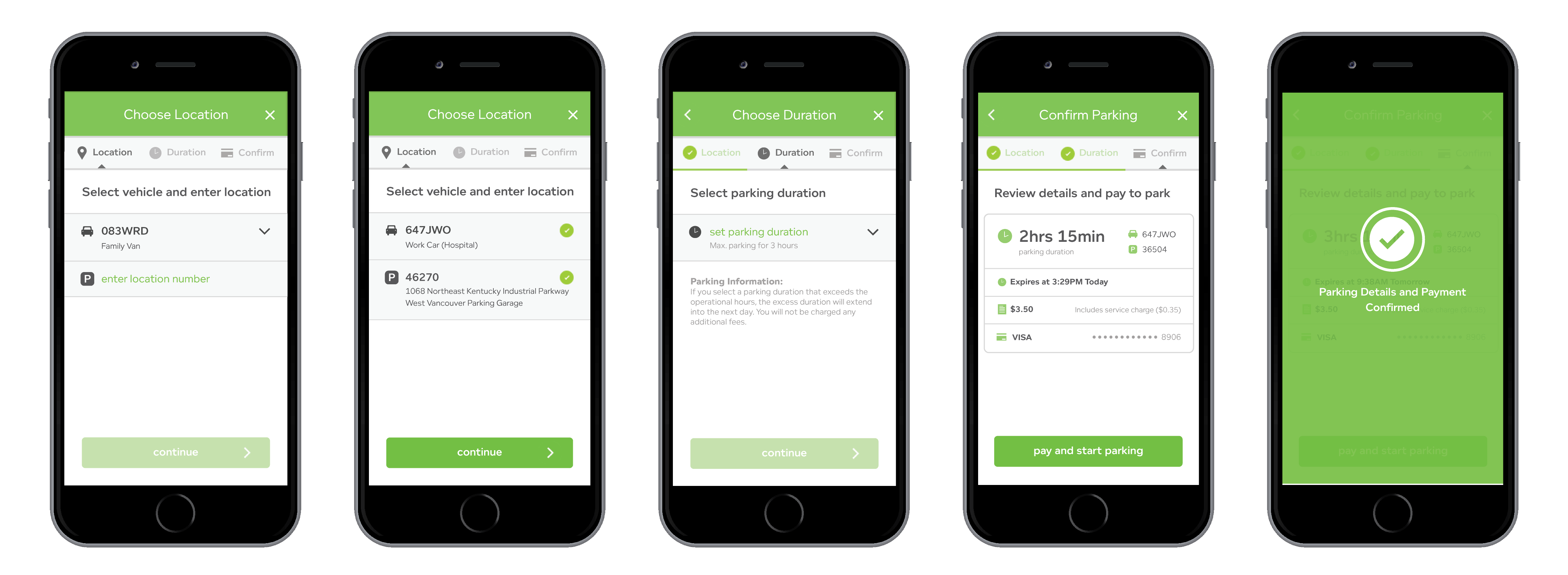
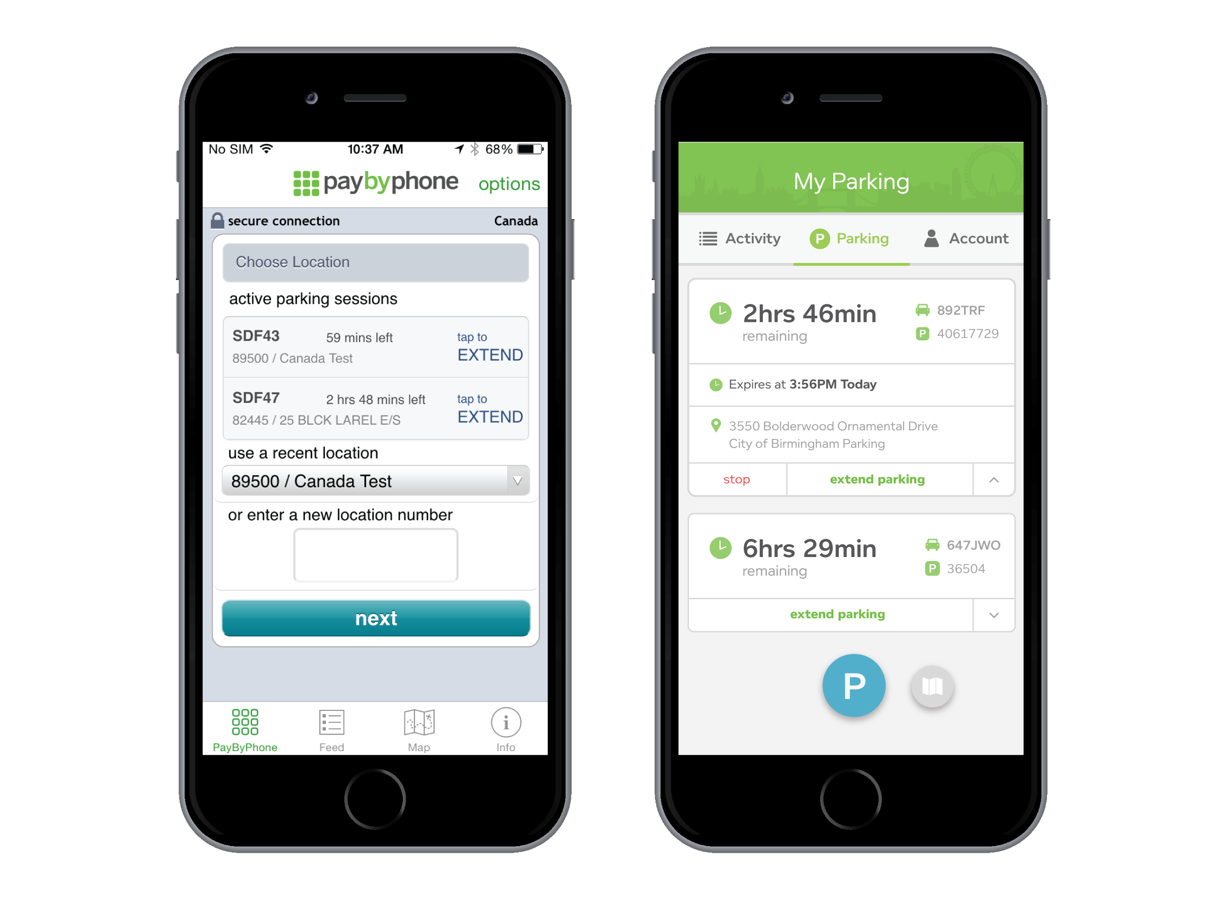
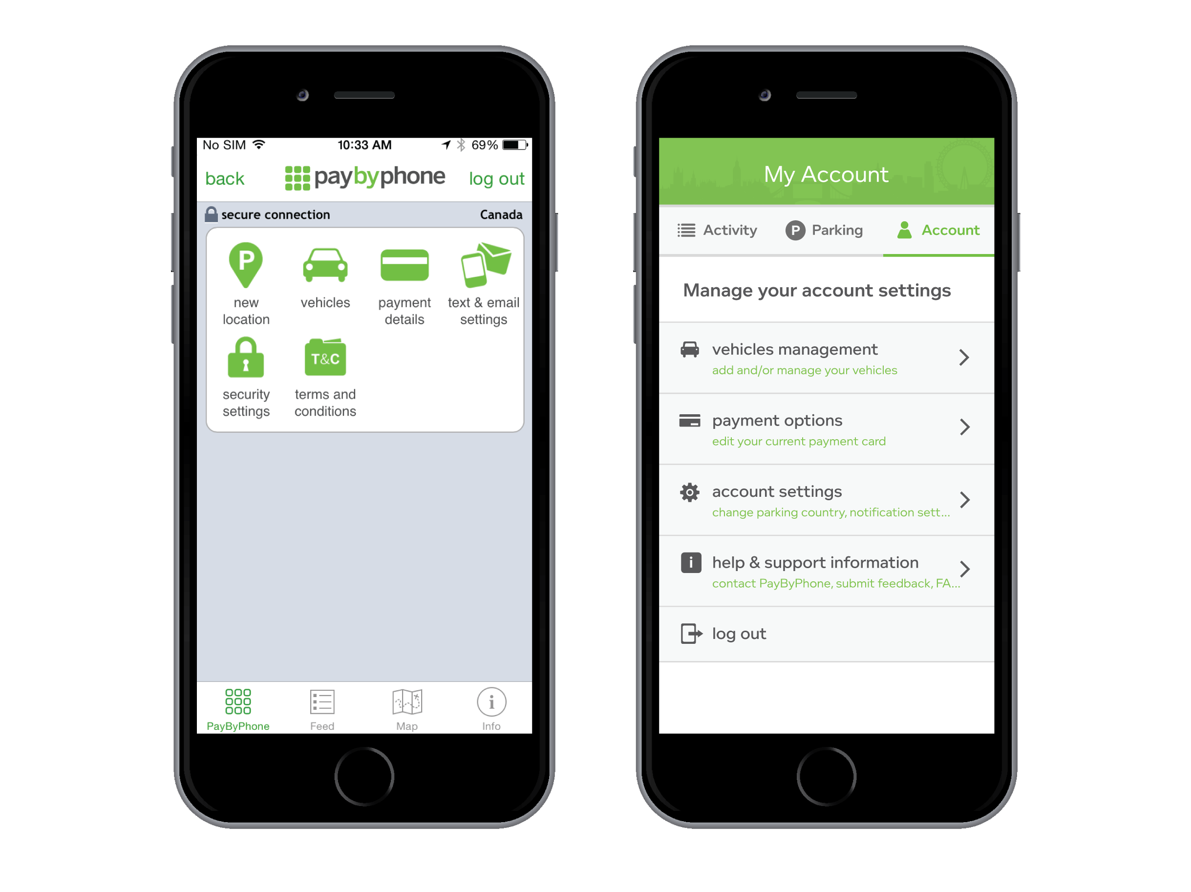
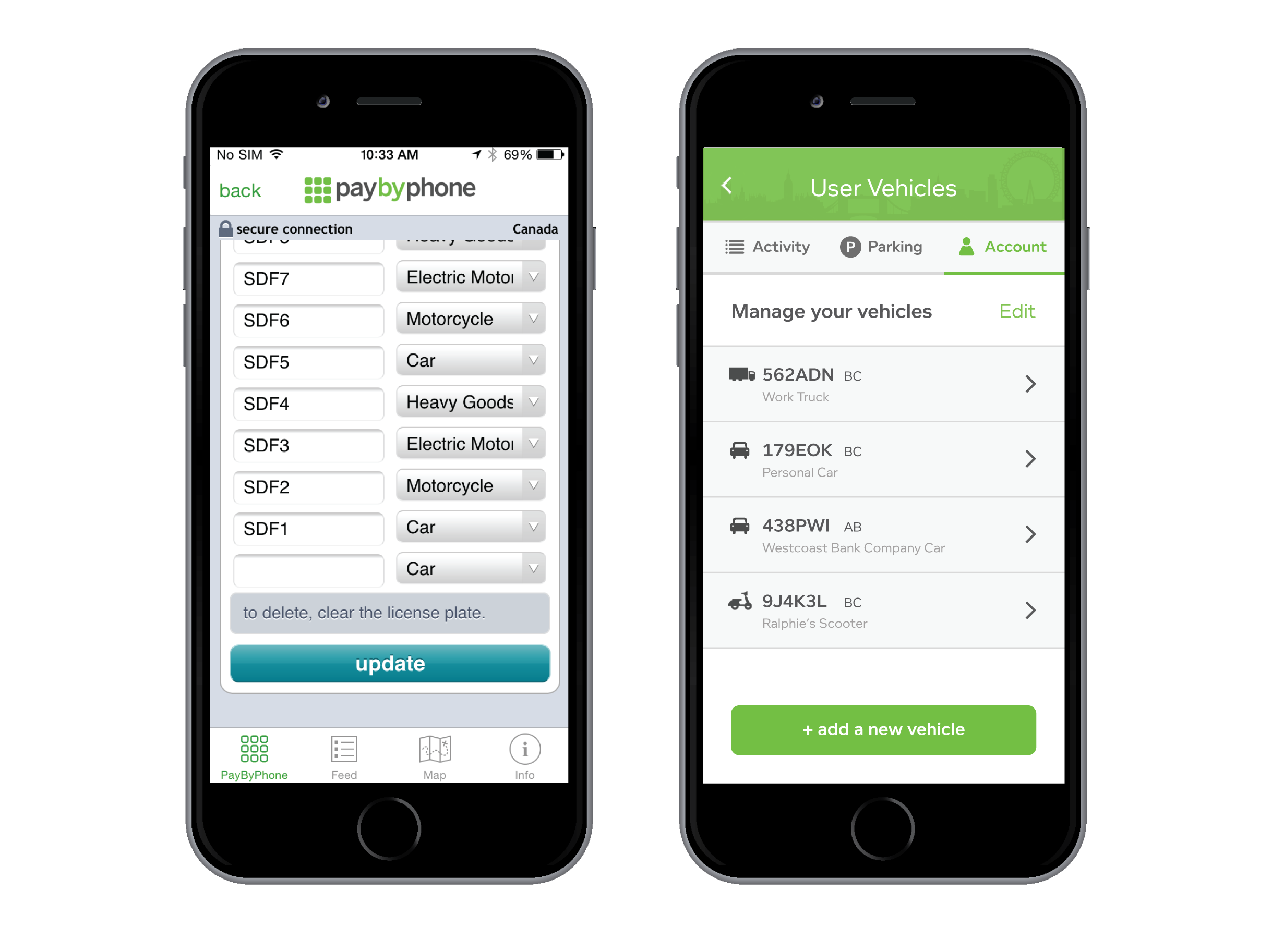
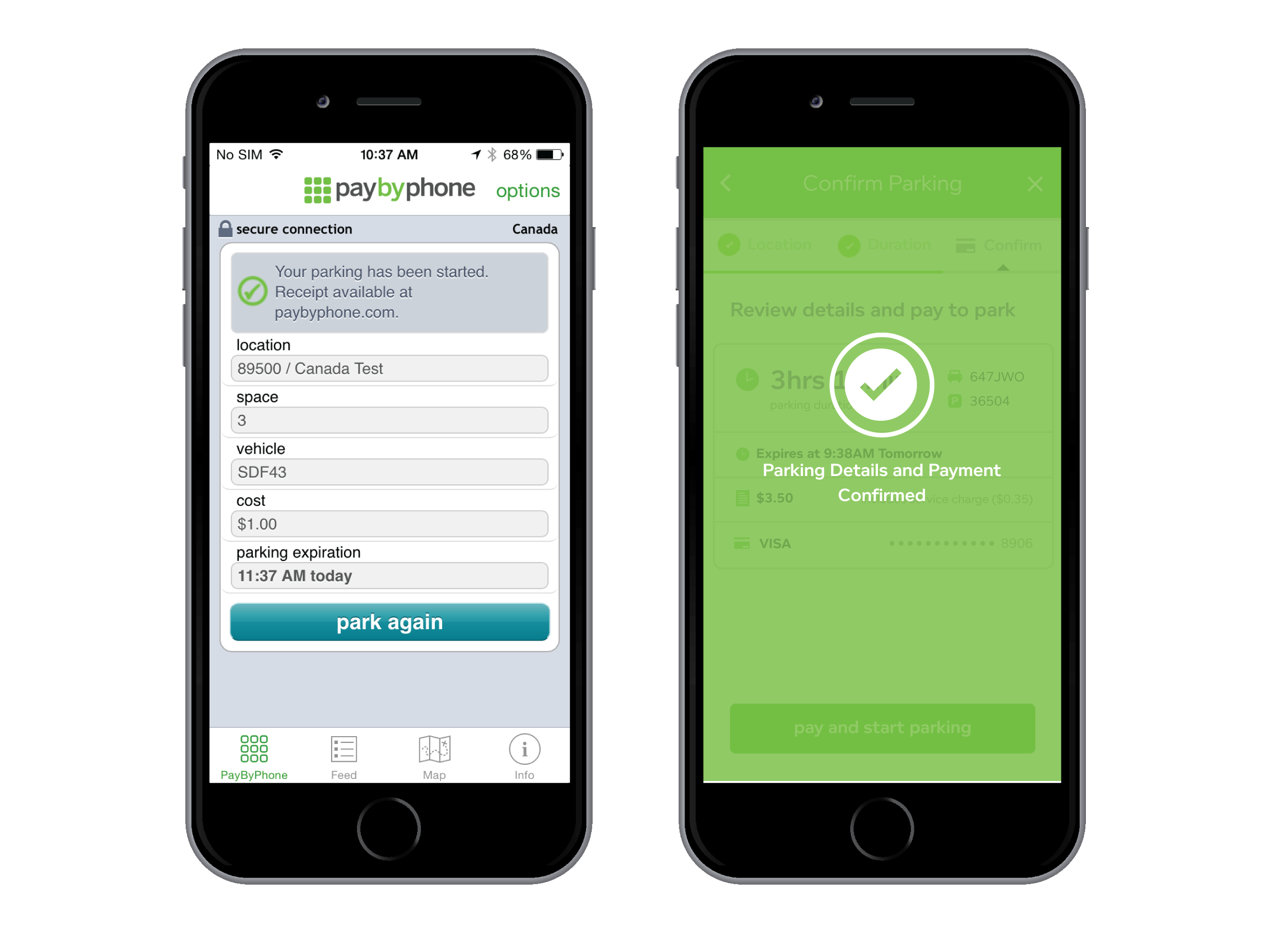
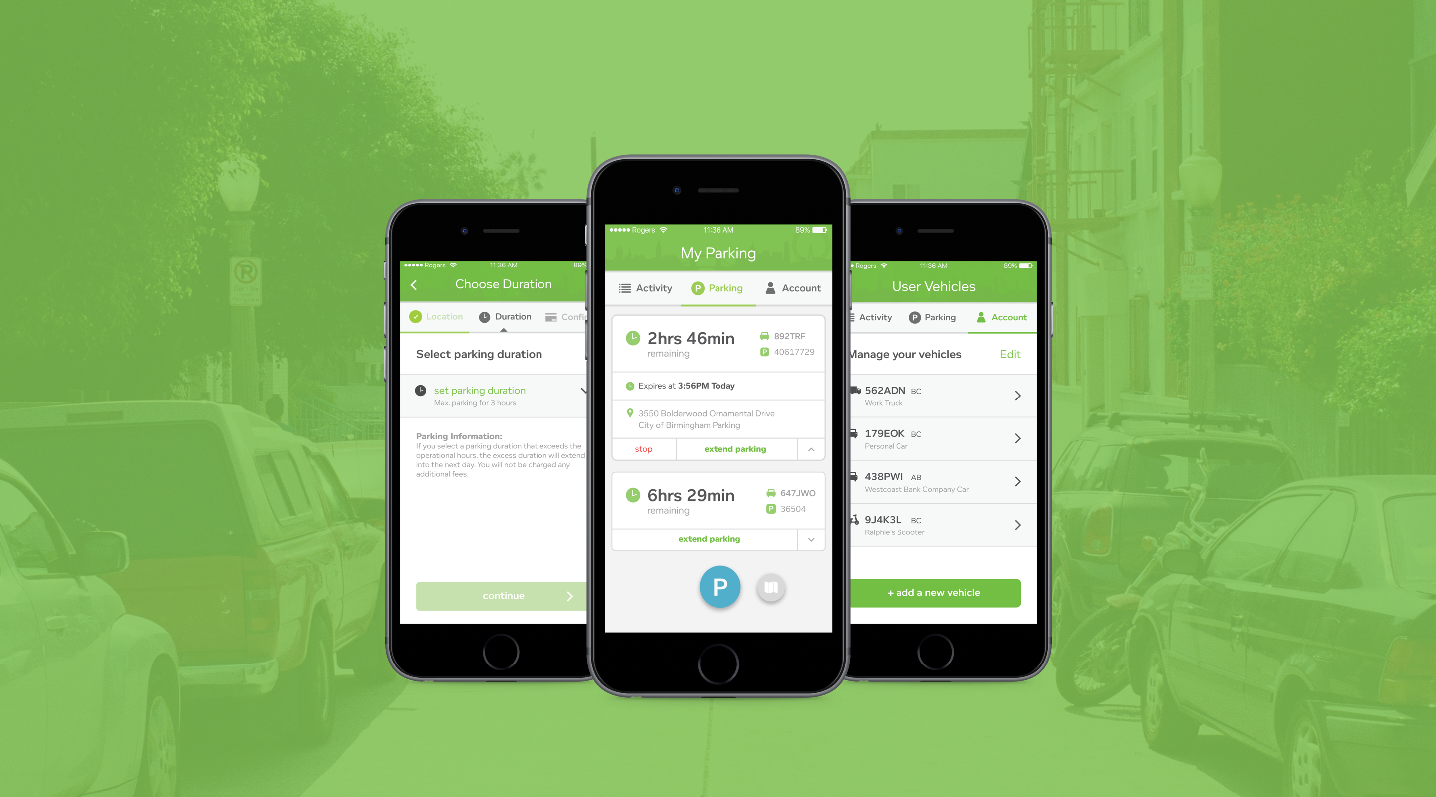
PayByPhone is a mobile payment app that allows users to easily pay for street/lot parking in hundreds of cities around the world. Enter parking meter code, select your vehicle, and pay digitally with your mobile device. Keep track of your parking location so you can easily find your car. You can also extend your active parking sessions through the app - no need to rush to the car ever again. A personal parking meter that fits in your pocket!

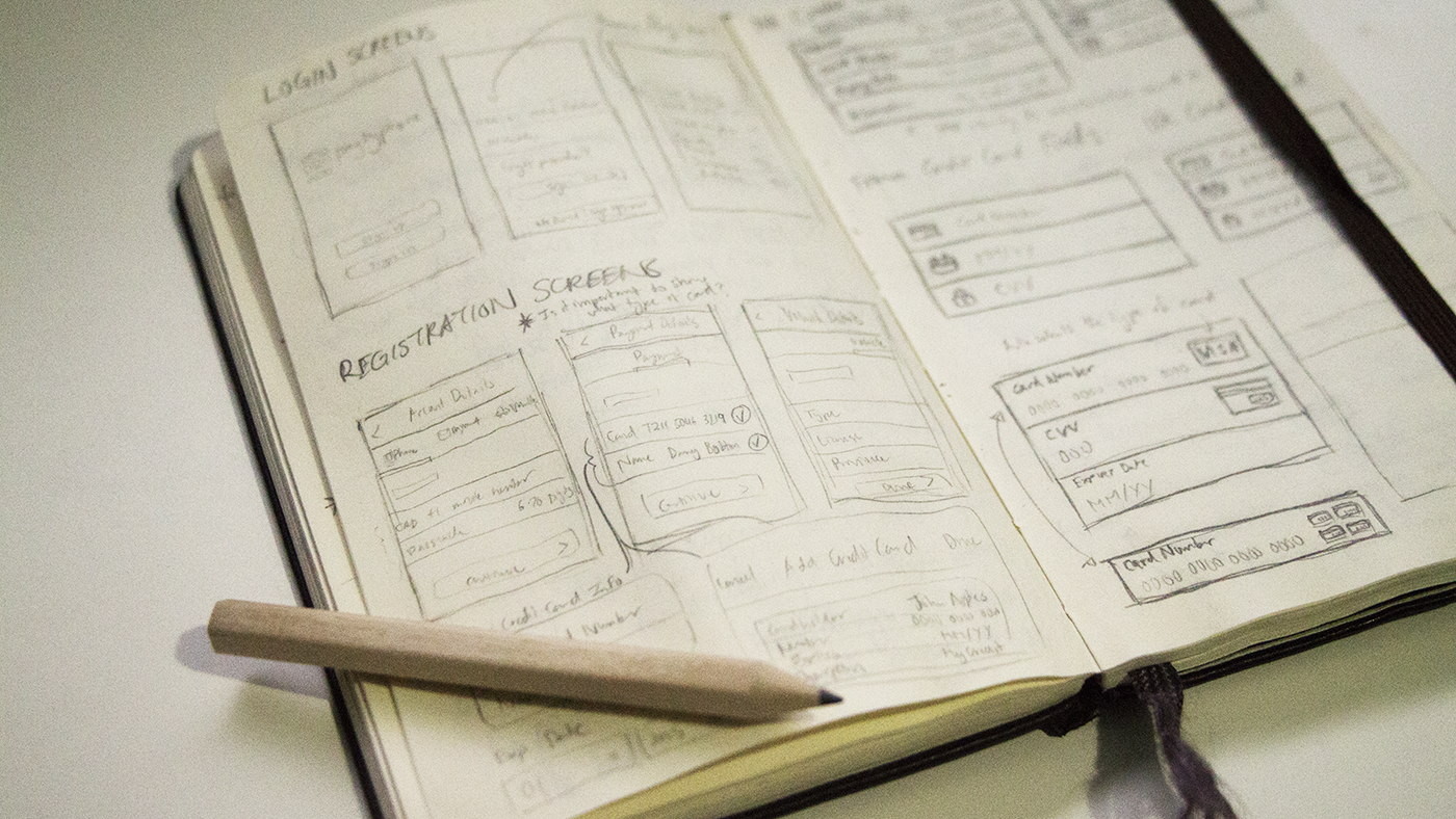
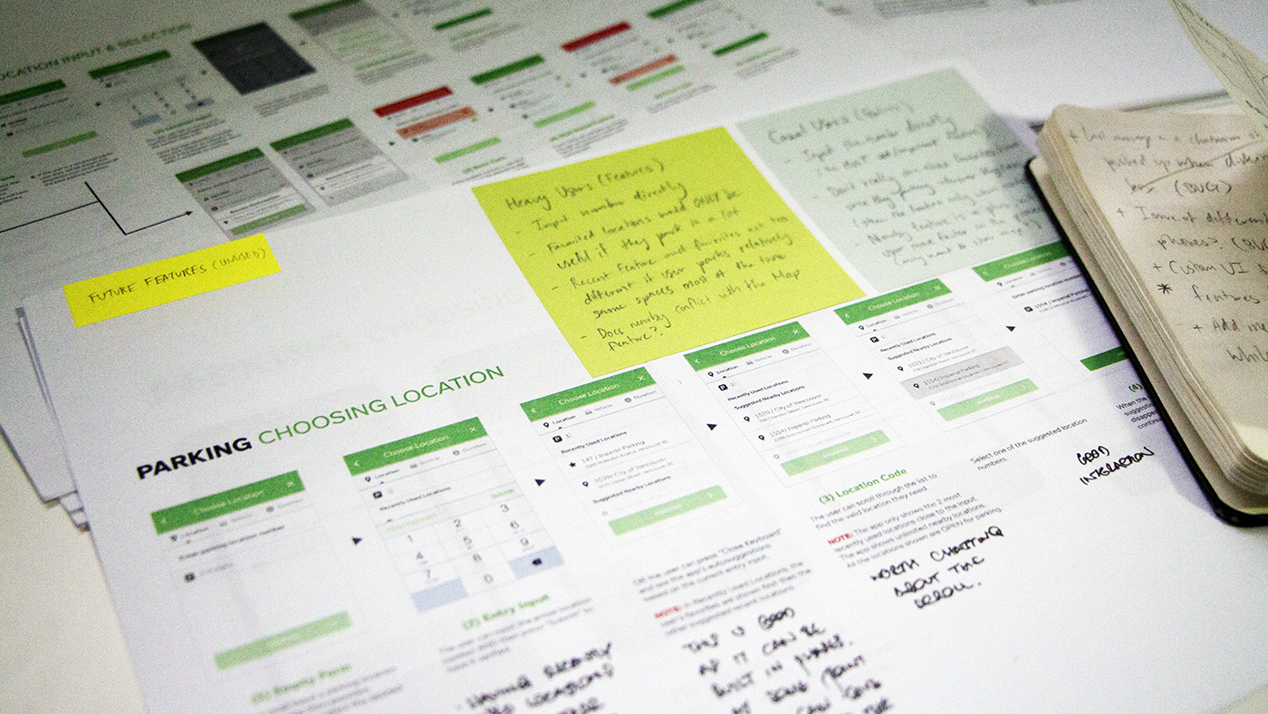
As the company's first in-house designer (and intern), I was in charge of creating a brand new iOS app experience. I helped define a new vision and direction for the brand and produced high quality deliverables and mockups to highlight the product.

Team: Stuart Congdon, Jason Boast, David Gadd, Greg Hookey, Mike Samuels

Tools: Adobe Illustrator & Photoshop, Proto.io, Sketches

Type: Internship (4 Months)

Project Length: 4 Months (Fall 2015)

City skyline illustration

DESIGN PROCESS

Business Problem

Hired to be the company's first ever designer, I was tasked with redesigning the entire iOS app and experience. As the business was continually expanding, PayByPhone rebranded itself and wanted to update their digital platforms. My role in this project was to determine the existing painpoints and produce viable and feasible solutions to improve the user's parking and paying experience.

First of all, I conducted user interviews on the streets of Yaletown, Vancouver, to get a better understanding of how people used the app. I interviewed casual and power users to get a wide range of feedback. I also compiled all the previous usability studies (PayByPhone), research (ADGI) and app reviews that PayByPhone had conducted. Here is a summary of all my findings:

Previous interface

Understanding the User

Next I created a user journey framework to highlight all the various touchpoints of a typical user. This allowed me to find the opportunities and openings to intervene as well as identifying the common painpoints users encountered.

User journey framework diagram

I also looked at the existing app interface and created an information architecture (or user flow) diagram to see how a user would navigate through the app. I took screenshots of the entire interface and compiled them into a single diagram. This was also a very important document because it allowed me to discuss with the PMs about previous design decisions and identify navigational issues.

Information architecture diagram

Design Ideation

At the start of the project, I sketched out various designs, testing out different layouts and information hierarchy. I wanted to create a consistent visual style that would align with the PayByPhone brand. I did quick low fidelity sketches and shared them with the team to discuss and iterate. This proved very helpful as my PMs and developers could point out potential technological problems and usability concerns.

Initial sketches Sketchbook and notes Design iterations

Final Deliverables

Once we finalized the overall design and flow, I converted my sketches into more refined high-fidelity mockups. After they were approved, I created user interaction models and measurement diagrams for the mobile development team to implement. These diagrams were also used in meetings with stakeholders and board members to highlight the current direction of the iOS product.

Initial sketches

APP INTERFACE

Streamlined Navigation

For a majority of the time, users will be focused on the landing screen (parking feed) which shows all their active parking sessions. I designed the interface to be clear, concise and organized. I divided the app into three main sections: activity feed, parking feed, and user account. These three serve as the main navigational bar which allows the people to easily use and navigate through the app. The floating action button makes it easy for users to start a parking session.

Home screens

Simplified Parking Flow

The parking flow is the central experience of the app, where people enter a location number, select vehicle, input a duration and pay to start parking. I redesigned the interface to match mobile app standards; the original app built using PayByPhone web app's code. I optimized the interface for legibility and increase ease of use in order to reduce cognitive overhead. For example, I used color opacity to indicate active and inactive states (opaque vs. solid color for buttons).

Payment screens

Card Based Interface

By utilizing cards, users can glance and get a quick overview of their sessions’ current status. Users can also easily stop or extend their parking sessions.The list of active parking sessions are ordered by expiration time, starting with the closest expiring session.

Card interface

App Settings

I merged the general settings and app information into one screen. Previously, the settings and info page were seperated into two screens which made it hard for users to navigate and find the right settings. Now, users can easily go to any app setting and make the necessary adjustments.

Settings interface

Vehicle Management

Users can now easily edit, delete or add vehicles. I added an additional line of information: vehicle description. This provides greater context to the user, allowing them to quickly differentiate the different vehicles attached to their account.

Vehicle interface

Visual Feedback

In many cases, users were not sure if they had successfully parked which led to increased parking sessions being dropped and mistrust in the system. By implementing more visual feedback states, the user understands if they successfully parked.

Feedback interface

Error States

One of the main issues with the previous interface was a lack of context in error handling. With the new design, the interface highlights where the error is and provides users with additional help/information to resolve it.

Error state interface

Ending Thoughts

Despite my best efforts, some of my proposed features were not implemented due to various reasons. For example, I wanted to add a "Favorites" feature that would allow users to save their most commonly used parking locations. This would allow edge case users (such as delivery services, limo drivers, etc.) to easily select their desired location number. However, this was deemed too high on the tree for the developers to accomplish. I solved this by having the last used parking number pre-saved in the parking location field when a user opens the app. Another feature I felt strongly about was having the map indicate available parking spots nearby. This would make it easier for drivers to find an open spot without having to cruise around and waste precious minutes and gas. Similarly, this wasn't possible due to technological and feasibility issues.

At the end of this internship, I realized that in order for PayByPhone to become the leader in the parking industry, it was imperative for the business to start investing more into the digital product experience and service. In the foreseeable future, I believe that PayByPhone should start looking into smart parking technologies and see how it can integrate into their ecosystem to make them even better.